Overview
Connecting communities through smarter, more seamless digital experiences
Washtenaw County Parks and Recreation is partnering with CivicPlus to launch a new website in December 2024 as part of a county-wide effort to improve digital engagement. As members of the Civic User Testing (CUT) group, we evaluated the CivicEngage platform—along with its integration with RecTrac and ParkFinder—to provide actionable insights for optimizing the site to better serve the community.
Research Questions

“How effectively can users navigate the website to find information about parks and nature in Southeast Michigan?”
Do users feel the website meets their needs for both active and passive recreation?
Are there any barriers or pain points in accessing integrated systems like RecTrac and ParkFinder?
User Requirements and Recruitment
Target Users: Washtenaw County residents of diverse demographics, including age, background, income, and technology comfort levels.
Recruitment: Community outreach through master plan data and local connections.
Compensation: Washtenaw County’s Hydroflask water bottles for each participant
In-person user testing sessions at Washtenaw County locations.
Testing focused on core tasks such as navigation, activity registration, and site usability.
2-3 testing stations with internet access to facilitate participant engagement.
CUT group Proctoring Script
Background & Objectives
This study evaluates the usability of the Washtenaw County Parks & Recreation website, focusing on navigation, system integration (RecTrac, ParkFinder), and community engagement.
Introduction (2 min)
Participants are welcomed, informed that the website—not them—is being tested, and briefed on the test structure, including tasks, the think-aloud process, and their right to stop at any time.
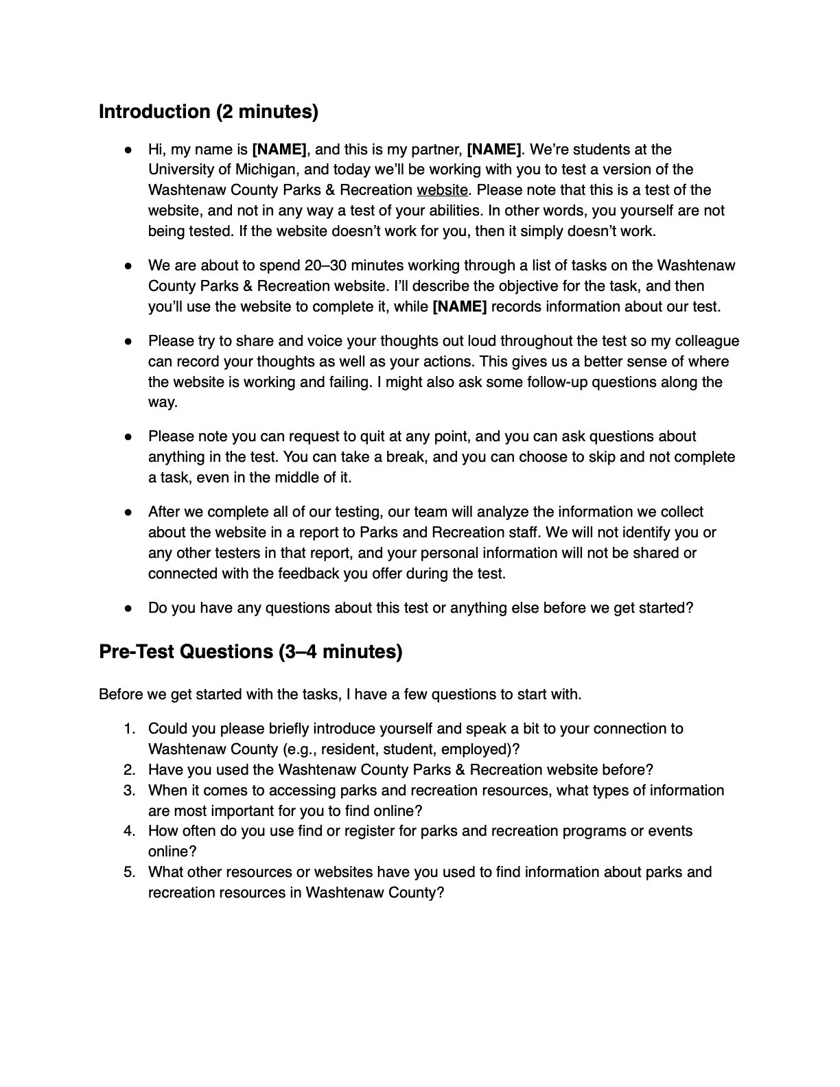
Pre-Test Questions (3–4 min)
Designed to assess prior experience with the website and relationship with the county. Questions cover:
Residency status and familiarity with the site
Frequency of online engagement with parks & recreation
Typical information sought and alternative sources used
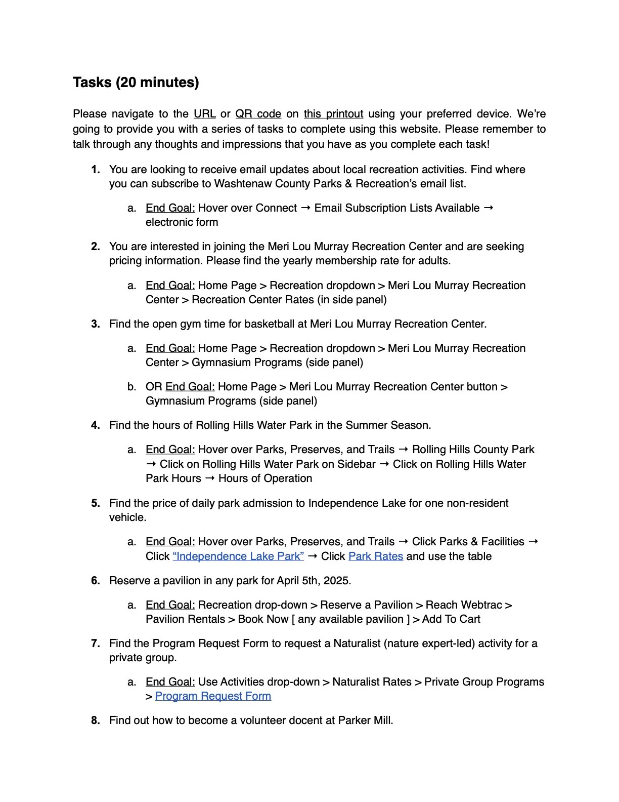
Task-Based Testing (20 min)
Participants complete real-world tasks to assess:
Navigation: Finding key info (e.g., membership rates, hours, registration)
System Integration: Usability of RecTrac (registration) & ParkFinder (search)
Efficiency & Pain Points: Task completion speed, difficulties, and frustrations
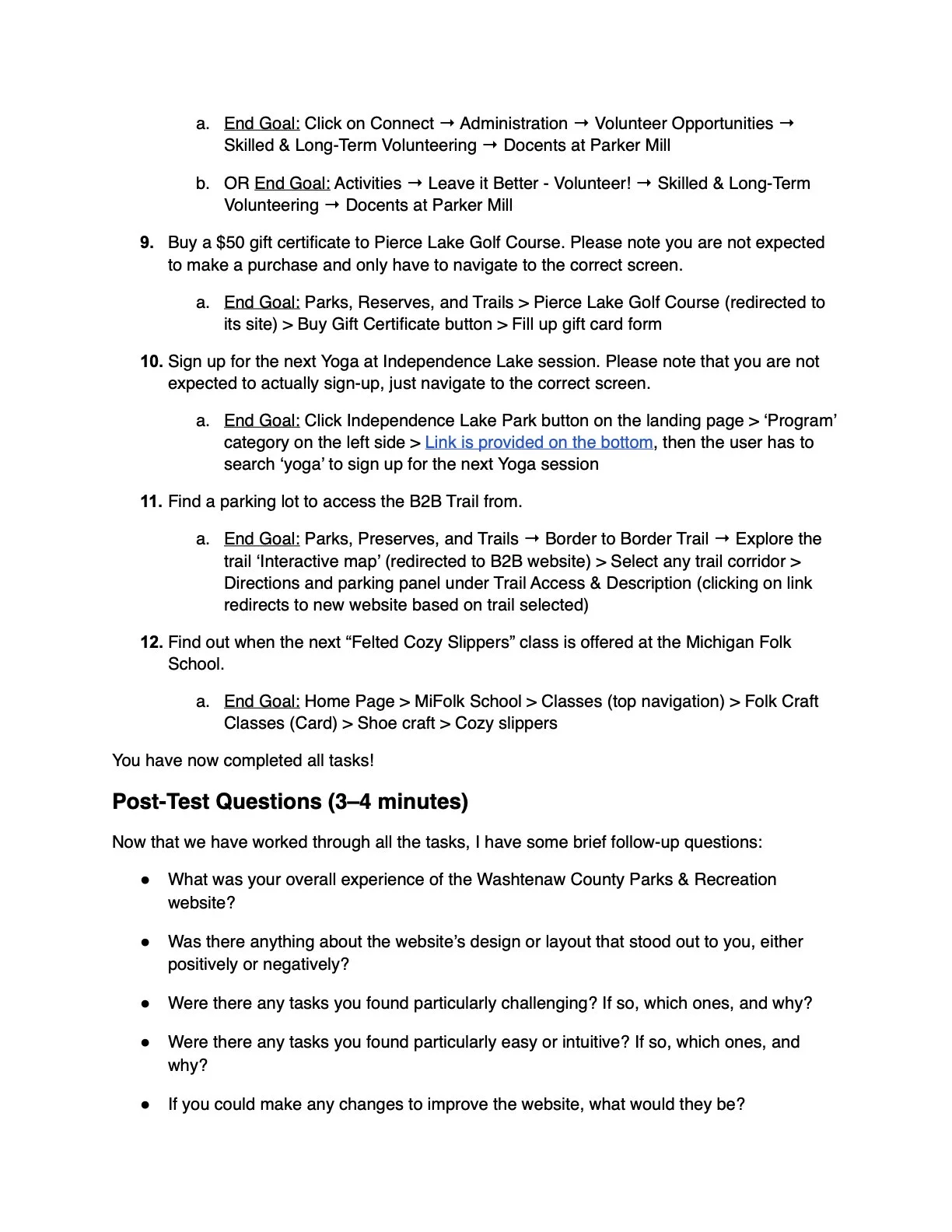
Post-Test Questions (3–5 min)
Collects final feedback on overall experience, pain points, and suggestions for improvement to uncover insights missed during task completion.

Project
Client Project
Industry
Government
Timeline
Jan 2025 - Feb 2025
Responsibilities
Create Usability Testing Protocol, Data Synthesis, Recommendation
Role
UX Researcher
Analysis Session
Findings


Redesign Recommendation:
Standardize sidebar categories and order across all park pages to improve consistency.
Through our user testing and analysis of the Washtenaw County Parks & Recreation website, we identified several usability challenges that impact how visitors navigate and interact with the site. By utilizing affinity mapping, we categorized key observations, direct user quotes, and behavioral patterns into actionable insights. Our findings highlight issues related to inconsistent navigation structures, information hierarchy, search functionality, and user expectations for content presentation.
Users reported difficulties in locating essential park details, frustration with vague or misleading links, and challenges in interacting with text-heavy layouts. Additionally, discrepancies in terminology and search functionality misalignment contributed to inefficiencies in finding relevant information. Our recommendations focus on improving the website’s usability through standardization, content restructuring, interactive enhancements, and improved search calibration. By implementing these changes, the website can offer a more seamless and intuitive experience for users seeking park information and recreational services.
Through user testing and affinity mapping, we identified recurring patterns in navigation challenges, content organization, and search functionality. Below, we categorize our findings into primary areas of concern:
Navigation & Consistency – Users found inconsistencies in sidebar categories and order across different park pages, making it difficult to predict where information would be located. Also vague or misleading links, such as "See More," often led to images rather than valuable content.
Information Accessibility & Layout – Many users struggled to find key details like admission fees and park hours due to text-heavy pages, excessive scrolling, and a lack of clear hierarchy. Users expected pricing and other critical information to be directly linked rather than buried in PDFs or scattered across pages.
Terminology & Information Architecture – The website’s categories and wording did not always align with user expectations. Terms like “Register” and “Connect” were unclear, leading to confusion about where to find important resources. Users also found the distinction between sections like “Activities” and “Recreation” to be ambiguous.
Search Functionality – Users relied on the website’s search bar but were frequently dissatisfied with the results. The search function often returned irrelevant pages or overlooked key content, making it difficult for users to locate specific programs or services.
Additional observations include users' reliance on Quick Links for navigation, confusion over interactive elements such as expandable sidebars, and difficulties in locating contact information. Many users instinctively scrolled to the bottom of the page for contact details, only to find them missing. Addressing these secondary usability concerns will further enhance the overall user experience.
Our recommendations focus on improving consistency, restructuring content for better readability, refining search functionality, and aligning navigation elements with user expectations. By addressing these issues, the website can provide a more intuitive and user-friendly experience for visitors.
Recommendation 1: Users report inconsistencies across individual park pages, including differences in sidebar categories and order of information within the body text.
Sidebar category options + labels vary across pages, making navigation unpredictable
Users report that key park information (e.g., admission fees, hours, amenities) is not presented in a predictable order or location across all park pages

Redesign Recommendation:
Standardize sidebar categories and order across all park pages to improve consistency.

Recommendation 2: Users expect important details such as pricing to be directly linked on the website for easy navigation.
“You should at least link to the price information in the ‘Admission Fee’ section.”


Recommendation 4: Users found categories and terminology to be misaligned with their expectations, leading to confusion about where to find information.
Not all participants had time to test all 10 prepared tasks
Due to time and recruitment constraints, a future version of this study could seek to increase the diversity of the participant pool
Some participants had prior experience with the original site, which may have influenced their navigation patterns
Participants with connections to WCPARC may have different expectations or prior knowledge compared to general users
Participants may have unintentionally influenced others’ responses if nearby discussions were overheard in testing room
Develop more tasks to assess interactions with Find Your Wild tool
Conduct accessibility audit and testing to ensure screen reader compatibility and comprehension by users with differing cognitive abilities
Perform additional testing on mobile interface to ensure usability across range of devices
Recruit more Washtenaw County residents without direct Parks & Recreation affiliation
Users expect key information to be included or hyperlinked, and report frustration when the correct category does not contain the desired information
PDFs for park rates, schedule, etc. were difficult to navigate for some mobile users, contents from the PDF file should be available on the website, not as a attachment.
Recommendation 3: Users report text-heavy layout makes it difficult to locate key information on website, leading to excessive vertical scrolling and overlooked details.
Users struggle to locate relevant information due to excessive text, small font sizes, and an overwhelming amount of content
Users were observed scrolling through pages multiple times before locating the sought information
Most important links and features are not prominently displayed
Essential details (e.g., availability, cost, and registration) are buried in the layout, requiring excessive scrolling
Users prefer to see critical information first with the option to explore further
Redesign Recommendation:
Reduce text density by breaking up content with collapsible content or jump links to provide in-page navigation
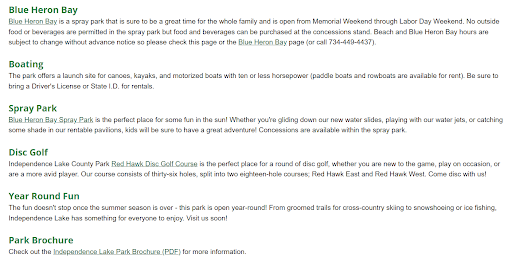
Consider alternative layouts and visual elements to diversify presentation of information.
Information hierarchy and word choice do not always align with users’ mental models or definitions of terms and categories
What is the distinction between “Activities” and “Recreation?” Many users guessed
Users thought of themselves as needing to “Register” for email, not “Connect”

Redesign Recommendation:
Separate top navigation into sections that align with user understanding. Consider combining links leading to same page (e.g., “Boating/Paddling,” “Boat Launch”) and organizing in alphabetical order.
